Components - shadcn/ui kit for Figma
Main Purpose:
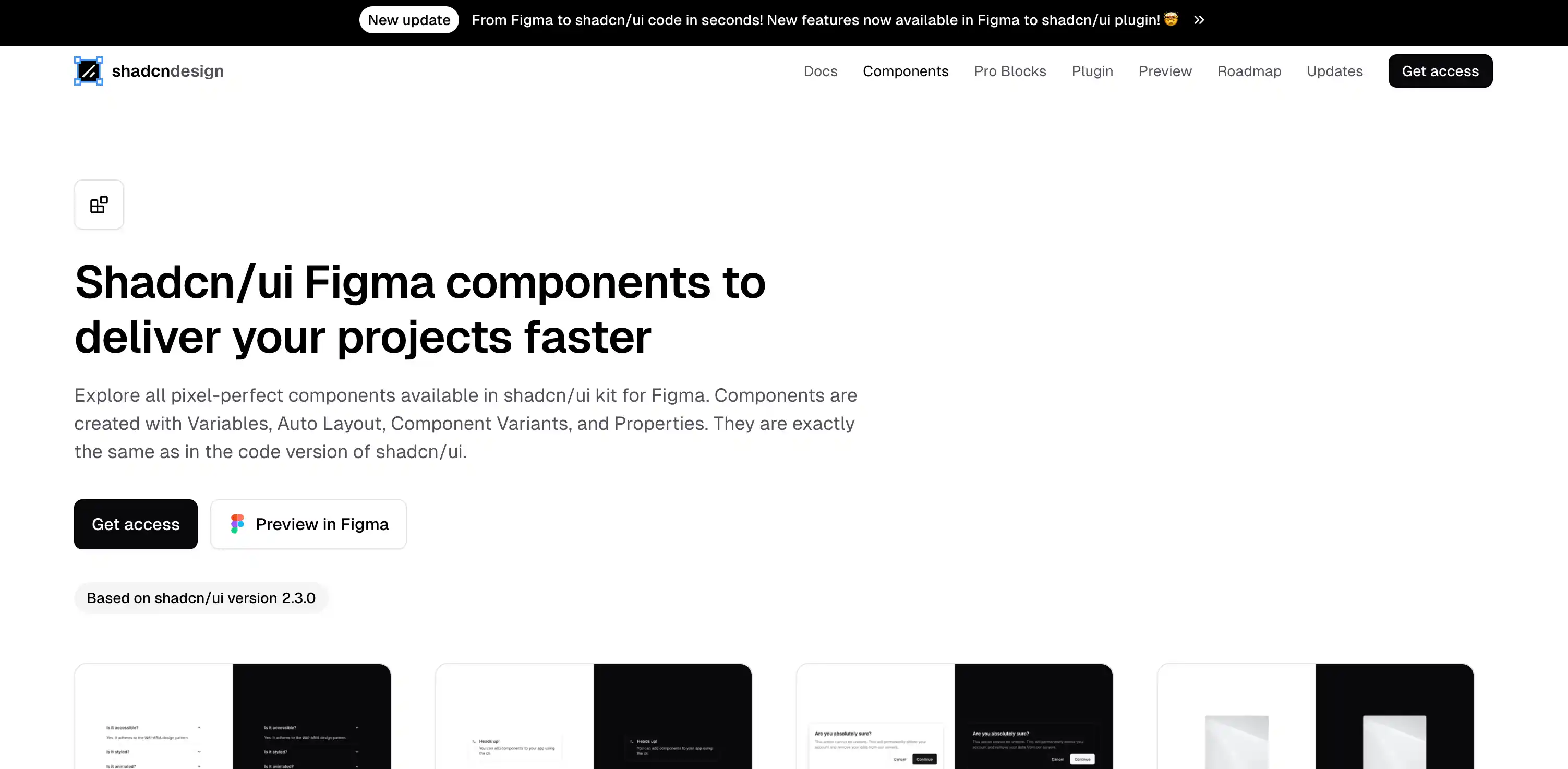
The shadcn/ui Kit for Figma is designed to help designers and developers deliver projects faster by providing pixel-perfect, code-aligned components. It bridges the gap between design and development, ensuring consistency across both stages.
Key Features:
Target Audience:
Ideal for UI/UX designers and frontend developers who value design-to-code consistency and want to accelerate their workflow.
What Makes It Unique:
Unlike generic UI kits, shadcn/ui Kit for Figma ensures exact parity between design and code, reducing handoff friction and enhancing collaboration.
Use Cases:
Perfect for prototyping, web app design, or any project requiring a cohesive, developer-friendly design system.
Why It Stands Out:
It’s not just a design tool—it’s a time-saving bridge between creativity and implementation.